The Framework

The science behind what your eye already knows.

What you're about to see has been operating in the world's most celebrated images for centuries. Your mind has been responding to it your entire life. This page makes it visible.

Why Some Images Stop You Cold — The Science Behind It

The principle at work — across painting, photography, and cut paper
Click the buttons to see small, dark elements balancing large, bright ones below.
=
You’ve been responding to this your whole life. Now you can see it.
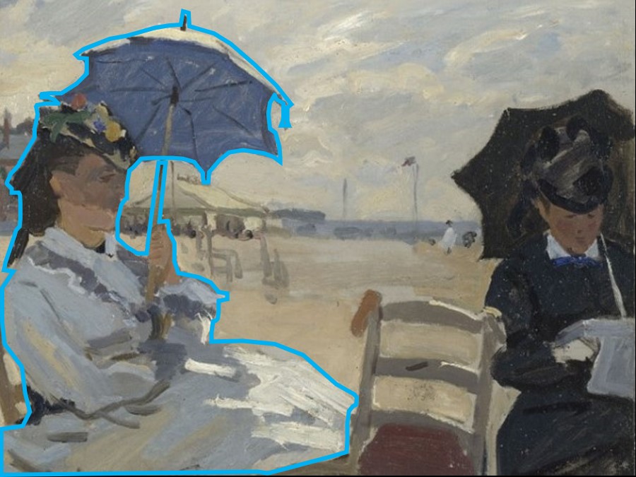
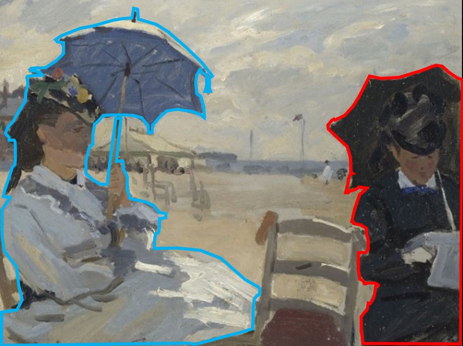
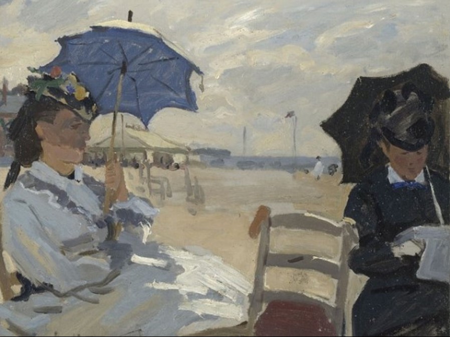
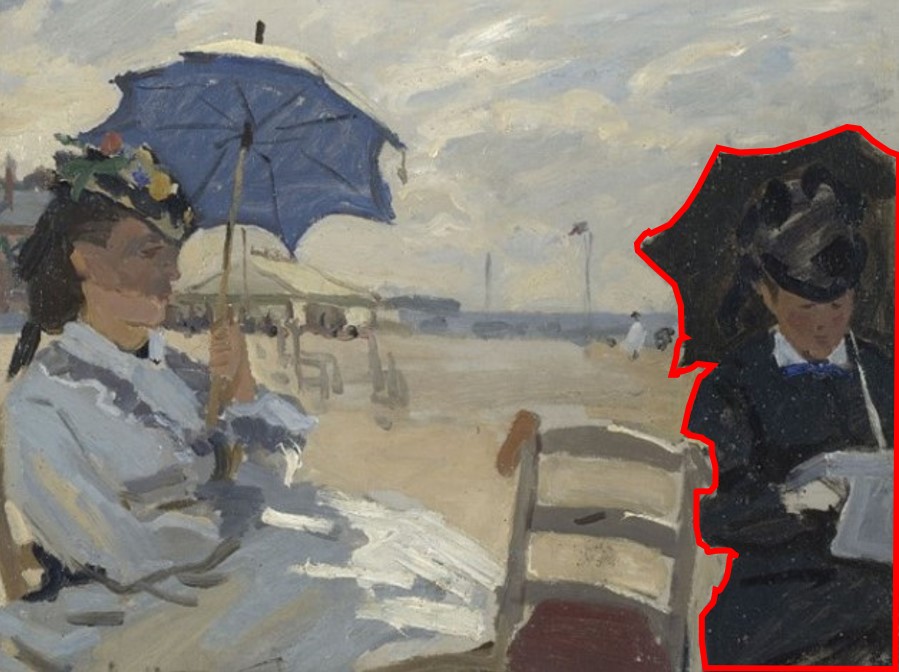
Claude Monet, La Plage de Trouville, 1870
Claude Monet, La Plage de Trouville, 1870. Public domain.

The small dark figure on the right — cut smaller by the frame edge — is balanced by the large, bright figure on the left.
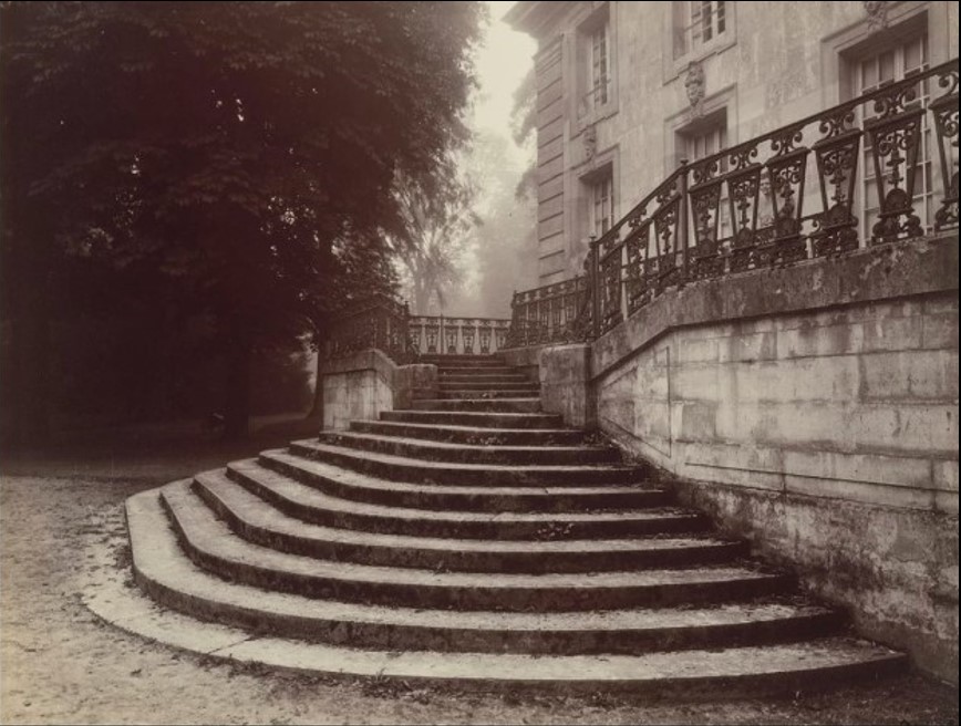
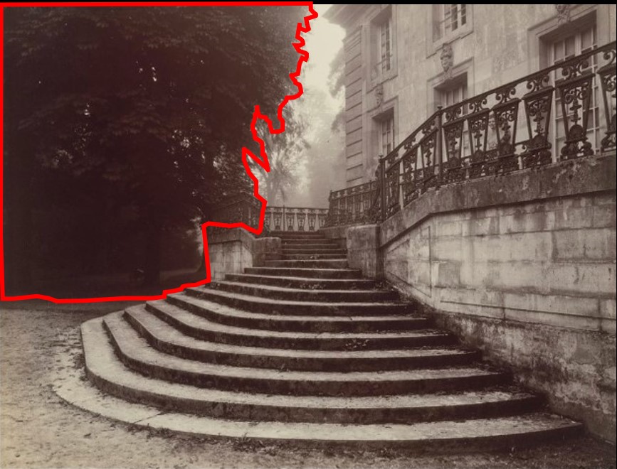
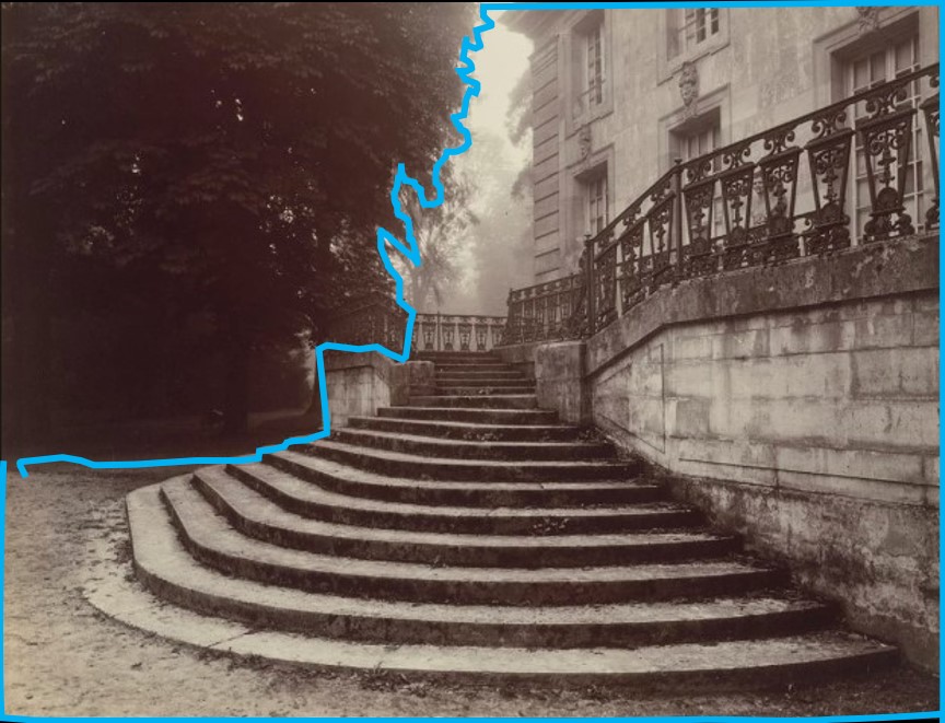
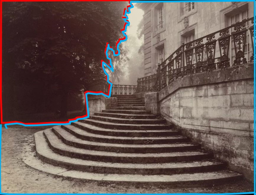
Eugène Atget, Grand Trianon, 1924
Eugène Atget, Grand Trianon, 1924. Public domain.

The small, dark tree and its shadow on the left balance the aggregation of large, bright stairs and house on the right.
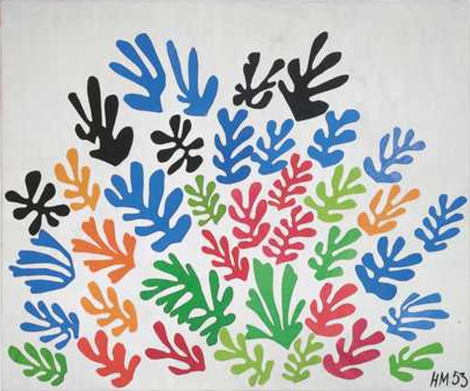
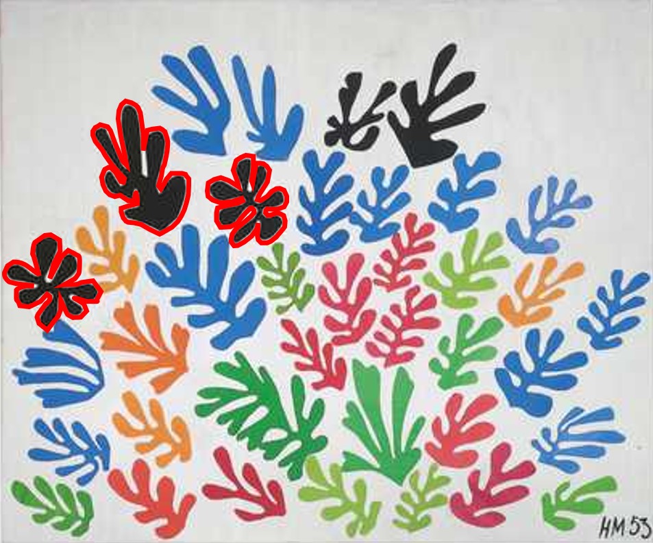
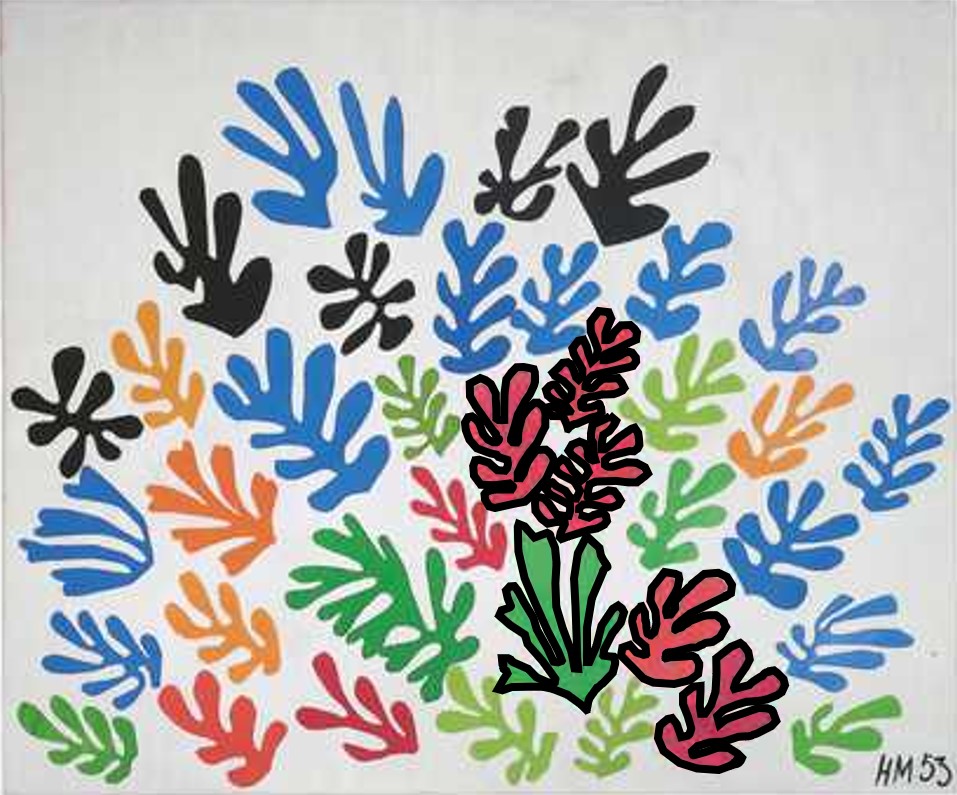
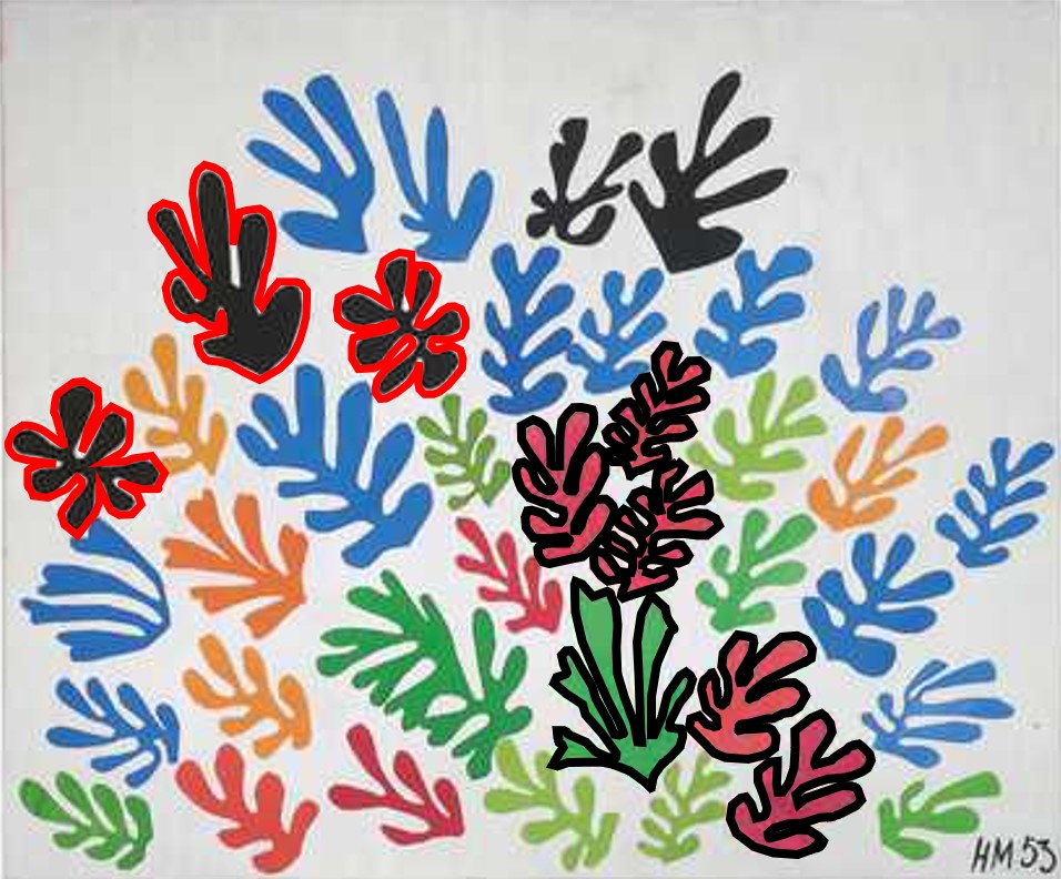
Henri Matisse, The Sheaf, 1953
Henri Matisse, The Sheaf, 1953. Public domain.

On the top left, three small dark objects extend nearly to the frame edge — like a child further from the centre of a seesaw, their distance increases their apparent weight. The tension created by those three dark shapes is resolved and counterbalanced by the aggregation of four and a half red forms and the larger, sharp-edged green object near the bottom right. Every millimeter of an image is considered by the pattern recognition part of our subconscious mind, however, for expedience sake — because this is a complex image — the 'major characters' of this 'story' have been identified.

That feeling in front of a great image — the one you couldn't explain — turns out to have a precise, scientific explanation. And once you have it, you have it for the rest of your life.

Start with Level 1 →
Small, dark
= Large, bright

What you just saw working across those three images has a name. The brightness–weight illusion — documented by Walker, Francis & Walker (2010) — establishes that dark objects are often perceived as heavier than equivalently-sized bright ones. This is a finding in perceptual psychology, not a theory of aesthetics — it operates before taste, before training, before any personal history with art enters the picture. What had never been done, until now, was connecting this mechanism to the long history of asymmetrical balance in visual art. That connection is the framework: an objective explanation not just of what artists were doing when they placed a small dark element against a field of light, but why it has worked the same way across every viewer, every century, every medium in which it has appeared.

I was the first to make this connection explicit. A manuscript has been submitted to Leonardo, the MIT Press journal of art, science, and technology. The phrase "small, dark = large, bright" is my formulation — the first time the principle has had a name.

This is a tool, not a rule. Compelling images don't require balance — but understanding why balance works gives you a choice you didn't have before.

Five disciplines. One structural constant.

The framework doesn't belong to one medium. Here's where it shows up.

01
Painting

The mechanism appears in Western and Eastern painting — not as a stylistic choice, but as a perceptual mechanism that artists applied intuitively across radically different traditions.

Monet · Van Gogh · Matisse · Picasso · Degas · Hopper · Vuillard · Hokusai
02
Photography

What looks like intuition in the greatest photographers is structural. The brightness–weight illusion governs why Cartier-Bresson's frames hold — why the decisive moment is also a balanced one.

Cartier-Bresson · Kertész · Robert Frank
03
Cinema

Great cinematography is great composition applied in time. The same perceptual principle that governs a Monet painting governs why certain frames carry the weight they do — and why others dissolve.

Kurosawa · Fellini · Roger Deakins
04
Architecture

Buildings that stop you cold are not accidents. The spatial grammar of the most compelling structures — the placement of mass, void, light, and dark — follows the same logic.

Frank Lloyd Wright · Tadao Ando · Zaha Hadid
05
Japanese Woodblock

The 1854 rupture introduced this visual grammar to Western artists — and they knew it immediately. The letters and journals of Degas, Monet, and Van Gogh document the encounter in their own words.

Hokusai · Hiroshige · Utamaro

Two ruptures that changed how artists see — and one connection that was never made

1854
Japan Opens — Paris Changes
The forced opening of Japanese ports sent woodblock prints into European studios. Hokusai and Hiroshige introduced a visual grammar — asymmetric, dark-weighted, dynamically balanced — that painters had never encountered. The Impressionists absorbed it permanently.
1945
Post-War Dismantling
The emotional aftermath of the war made anything associated with the pre-war world suspect. Formal compositional principles became collateral damage — generally abandoned not because they had failed, but because they were associated with what had.
2010
The Science Is Published
Walker, Francis & Walker document the brightness–weight illusion in perceptual psychology: dark objects are often perceived as heavier than equivalently-sized bright ones. The research exists in the scientific literature — but is never connected to art history or compositional analysis.
Now
The Connection Is Made
Paul Fremes brings the two ideas together: the history of asymmetrical balance in Western and Eastern visual art, and the perceptual mechanism that makes that balance possible. A manuscript has been submitted to Leonardo, MIT Press.

What happened after 1945 may have a precedent. When Renaissance painters recovered the geometry of perspective — a principle first used in ancient Greece and then lost for more than a millennium — they did not invent something new. They excavated something that had always been true. The work being done here is a similar kind of recovery: principles that operated intuitively across centuries of compelling images, now named, grounded in perceptual science, and available to anyone who wants to use them deliberately.

You’ve seen it. Now put it to work.

Start with Level 1 See the Photographs About Paul →